Regarding color trends, 2016 dared pretty eccentric combinations, in particular “Rose Quartz” and “Blue Serenity”. And 2017? Which are the trendiest colors for the home decor?
We want to propose to you an excursus on the trendiest tonality for your house flooring but, to do this, we need firstly to precise that these are part of the chromatic trend related to the more general Interior Design. As you know, floors are an integral part of decor, furniture and environment’s personalization and that’s the reason why the need to be considered like components of an ensemble, which involves all the other items of furniture, too. Shapes and lines are the result of a personal approach to style, while the floor’s color of the house should take into account spatial factors, harmonically perfect with furniture and covering.
So which are currently the trendy colors for house flooring?
To begin with, we refer to what declared at the beginning of 2017 from the famous Pantone Color Institute, a truly entity for the color glamour. The company Pantone Inc. is exactly specialized in the chromatic cataloguing and in the production of the colors’ identification system and it represent today the maximal international standard for nearly every creative (but also industrial) sector. Every year the Pantone Color Institute defines a chromatic line that is representative and symbol of the historical, social and cultural moment that the whole world is passing by.

Greenery chromatic line
The chromatic line of 2017 is named Greenery and has as key color the green, that Pantone defines “the neutral of the nature”. However, this does not mean obviously that the floors of your house should be green, unless you want them this color! The message of the Institute is simple: starting with a representative tone, it is possible to decline the whole color palette in ten different possible combinations, each one can be combined, in its concept, to the beginning chromatic line.
Greenery, actually. It is composed by a chromatic palette which take into consideration all the colors of nature, from the more delicate and evanescent tones to the more earthy and material one.
It is not surprising, then, that the new color trends suggest that the choices for interior design are oriented on material and ethereal colors, on neutral and shiny shades, deep or pastel, or even metallic.
It is therefore not surprising to find, in the ten available colors palettes, peculiar colors such as caramel and gold, rose quartz, lead, plum, brown, mahogany, pond, musk, bronze, onyx, bright white, blue, gray, cream, lilac. The colors of nature are unlimited, and Pantone has declined them according to specific categories that seem to recall the seasons: from the light and luminescent shades of winter and spring to that full and material summer and autumn one, to recall what he defined "The lushness of great outdoors", that is the lush beauty of the open air. In philosophical terms, Pantone speaks of his Color of the Year as a series of chromatic lines all aimed at achieving the same goal: canceling the division between internal and external spaces, reconnecting with naturalness, reinvigorating matter and the proliferation of an expressiveness that finds outlet not only in the Home Decor, but also in urban planning, architecture and global design choices.
Employed in Interior Design and house flooring, the trendy chromatic lines result in sober and linear solutions with black and white monochromes and Nordic-colored touches in a matte version, perhaps in blue tones.
And so, specifically, regarding bathroom environments, ceramic predominates in its most hyperrealistic collections, made of non-woody wood and non-stone stone, capable of creating almost a style in itself, on which it is possible to build the chromatic and furniture suggestions of all the rest of the house.
The aim is movement and dynamism, even transmitted from 3D surfaces, reliefs and engravings.
Even mosaics are still appreciated, mostly in coverings but not only, and especially in light and metal effect solutions that represent the perfect union of experimentation and design.
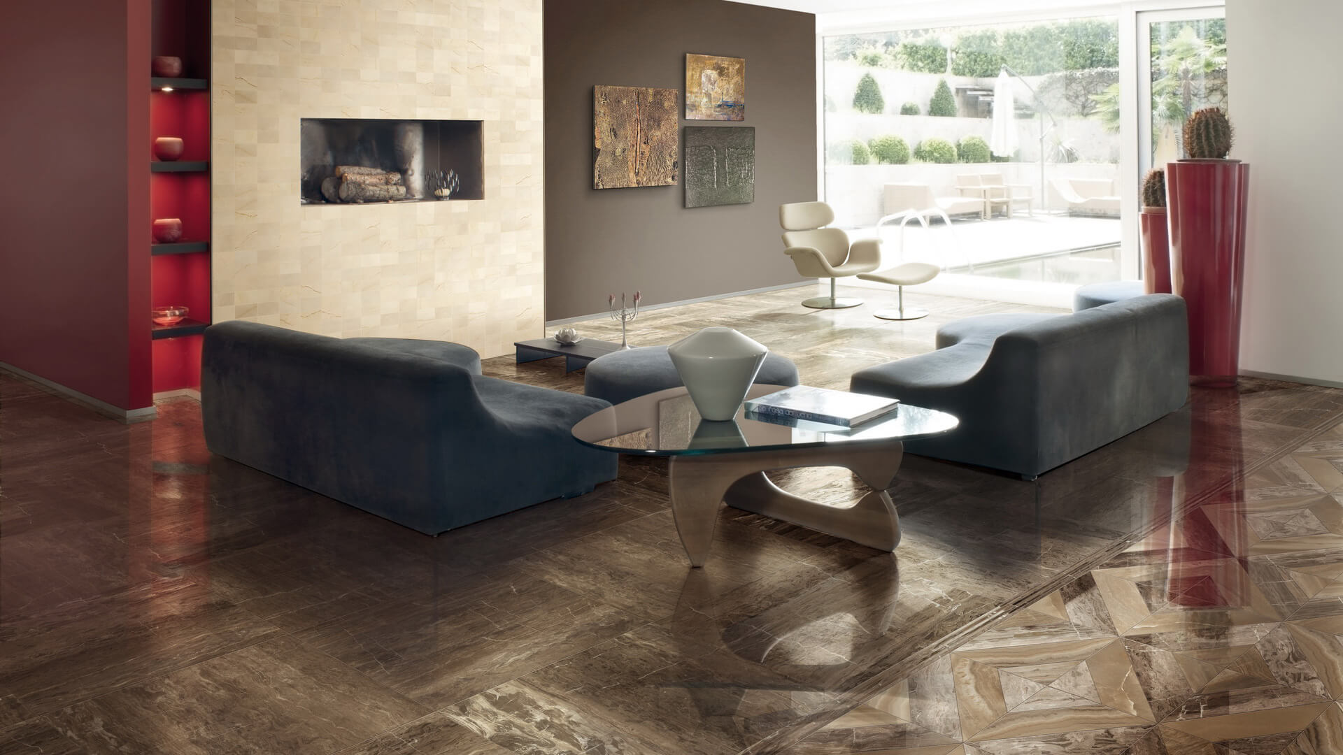
For the rest of the house, the floors recalling the typical tones of earth and nature predominate, so that it creates interpenetration between interior and exterior. It's the perfect time for kaki, dove-gray and ecru tones, up to elegant orange shades - even just in the engravings or in the inserts - that recall the late summer sunsets. Space also for the blue sky and, in general, for all the colors of the soil, from red to brown.
Floors with this personality are best matched with sober and of neutral shades decorations, complemented by well-calibrated elements and details in order to give color spots to a highly enveloping and strongly material environment.
Contrary to what has been said so far, the trend of total white in floors, coverings and furniture is still stable. It is the Nordic style, minimalist and essential, which characterizes above all modern and clean personality dwellings, where the geometric prints in fabrics prevail, recalling vaguely and softly the style of the 1960s and 1970s.
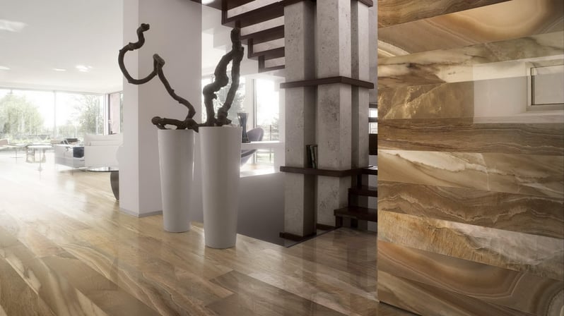
The materials of 2017 and probably of the next 3 or 4 years, know how to blend and fuse together, creating solutions that recall nature. Therefore, natural stones are preferred for floors and coverings for their ability to return the earth's timeless appeal but also for their technical characteristics of durability, compactness and strength. They come with woods, or non-woody woods, typical of some fine ceramics.
In general, in choosing the color for home flooring, remember that the goal of current interior design trends is minimalism, with its complete renunciation of frills to “leave space for space”. The space to look, to move, to be free, to breathe, to observe, to receive light. At the same time, there is still a marked tendency to decoration and to a specific, pompous elegance from large brands that have made of this feature one of their most recognizable characteristics, completely free from the passing fashions and related, more than anything, to the identity and the awareness of the brand.
Lighting Design will therefore be the complementary variable to flooring, coverings and furnishings to keep always in mind: always present and always enhanced through color choices that can give it value to the best.