%20-%20Copia.jpg?width=798&height=449&name=walk%20(1)%20-%20Copia.jpg)
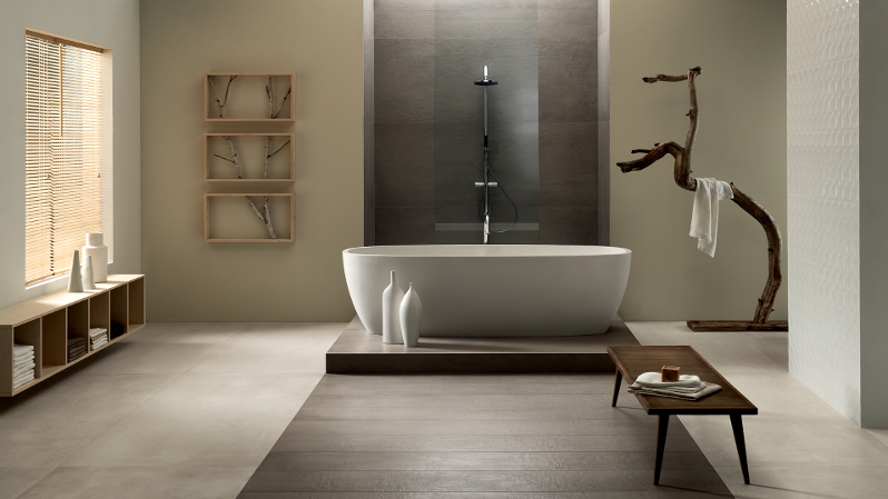
Have you ever thought of a two-tone solution for your floors? You are wondering which is the best strategy to follow to make the right choice, which geometries apply, which measures to choose, which colour to match?
If the answer to these questions is yes, what you need to keep in mind first is that the "right" rule doesn’t exist except the one that is good taste. In this sense, you can request the support of an interior design consultant that will help you identify a number of discriminants to create a truly perfect environment for two-coloured floors.
The decision-making factors to determine which two-colour floors to choose for an environment include:
- The amplitude of the room
- The typology of the environment
- Natural or artificial lighting
- The style of furnishings
- Functionality
These criteria are needed to best frame the solution that can really reach the project goals you have set.
Let's take a practical example for a quicker understanding: you have a large, spacious, and above all well-lit kitchen environment. You have choose the installation of two-tone floors, to give the room more dynamism and personality.
How to choose?
Assuming wide-ranging, a proposal might consider white as a base colour to alternate with another dye. What do you have to keep in mind to choose the one that suits your needs?
The colour and style of the kitchen, its hangars and its shelves is certainly the first criteria to not underestimate. If you have chosen an intense or lively colour solution, such as red or brown, your two-colour floor might have an alternation of white and black tiles or white and pearl grey. Neutral dyes are able to provide personality to the environment without weighing it down, or - worse! - make it even confusing.
A good choice of tow-colored floors will also allow you to achieve a contrasting effect with the furniture elements or walls, breaking the continuity between horizontal and vertical surfaces. Remember that the same inverted colours can give you a very different result: the position of a dye determines the perceived effect.
Even in this case, a trivial practical example will help you understand what we are referring to: Black furniture on white floors gives rise to a very different perception than white furniture on black floors, don’t you think?
Be careful, therefore, to choose the colours to match and place them with the utmost attention: there are no definite tips for this kind of match, but in general we can argue that the "heavier" colour (generally the darkest one) should be positioned towards the low, to make the environment the best balanced.
In theory, therefore, you will prefer a light base for your two-coloured floors to give impetus and breath to the environment without suffocating it or causing a strange and shrinking optical effect.
Conventionally, our culture let us associate dark shades with a concept of heaviness and stativity. In this sense, the location of darker shades downwards represents a kind of formal equilibrium. Towards the top, however, we will have to give space to the cleanliness, the brightness, and the overall enjoyability of the spaces.
These are just some formal rules. Any good interior designer, however, will tell you a great truth: each environment represents a microcosm for itself, and should therefore be a whole. Each project is unique!


